Close-up of the Le Vivisci Bordeaux emblem embossed in copper on a dark cover

LE VIVISCI

LE VIVISCI

WHERE BORDEAUX BEGAN

BRAND IDENTITY / STATIONERY / BROCHURE / MEMBERS PORTAL

Le Vivisci takes its name from the ancient Gaulish tribe whose capital became modern Bordeaux. A private wine members house conceived for ultra-high-net-worth individuals, the club required an identity that carried genuine depth. Not the aesthetic of luxury. The substance of it.
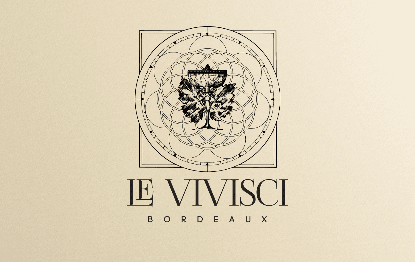
Le Vivisci Bordeaux emblem and wordmark on a cream background
THE BRIEF

Build a brand world that rewards those who look closely. An identity with layered symbolic meaning, precise enough to intrigue, considered enough to hold up under scrutiny.


THE DIRECTION

The logo was built with multiple symbolic layers, designed to reveal meaning to those with the knowledge to read them. Nothing surface level. Everything intentional.


THE EXECUTION

Brand identity, stationery, membership brochure and members portal delivered as one complete system. Every touchpoint designed to communicate the same thing: that membership here is not a purchase. It is an entry into something that has earned its own history.

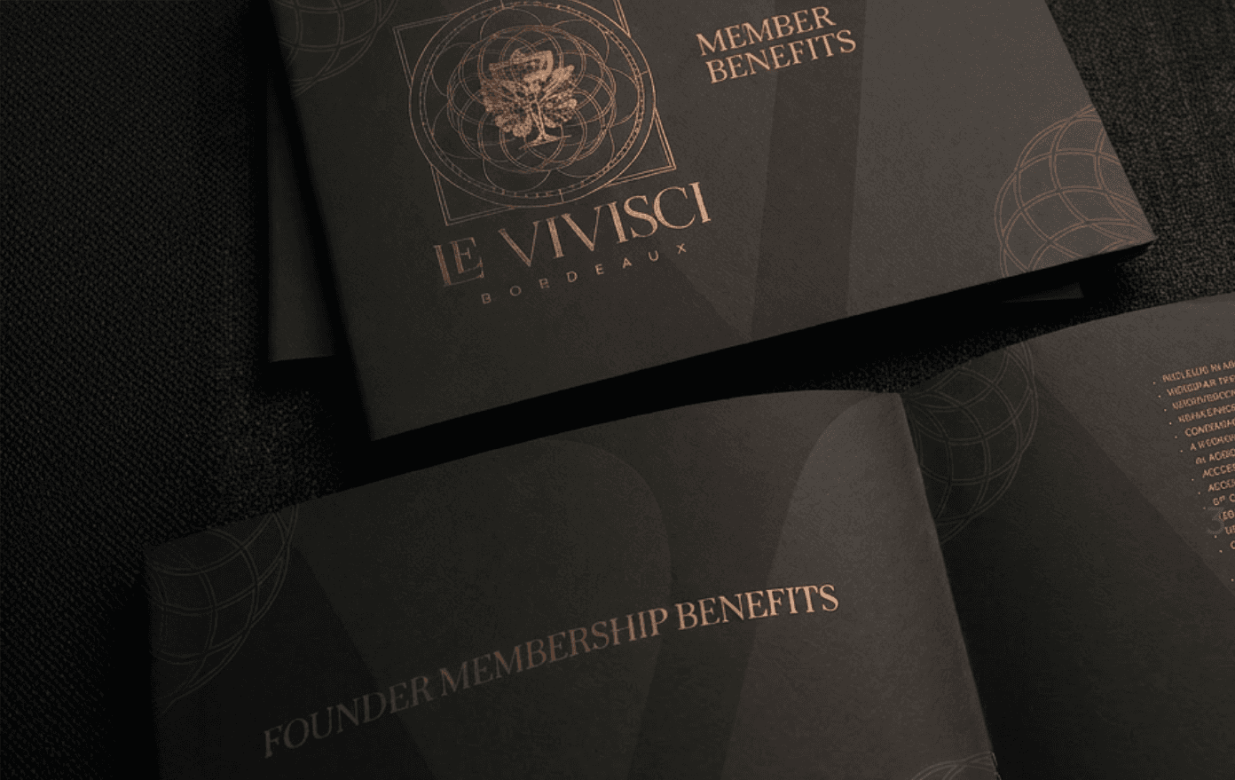
Le Vivisci membership benefits brochures with copper typography on dark covers
Le Vivisci members portal displayed on a laptop
Le Vivisci stationery with membership card, embossed emblem and red wax seal
The most enduring identities are built around meaning, not aesthetics. Aesthetics follow.